
Thursday, 24 March 2016


Wednesday, 23 March 2016


Tuesday, 22 March 2016


Friday, 4 March 2016
Wednesday, 24 February 2016
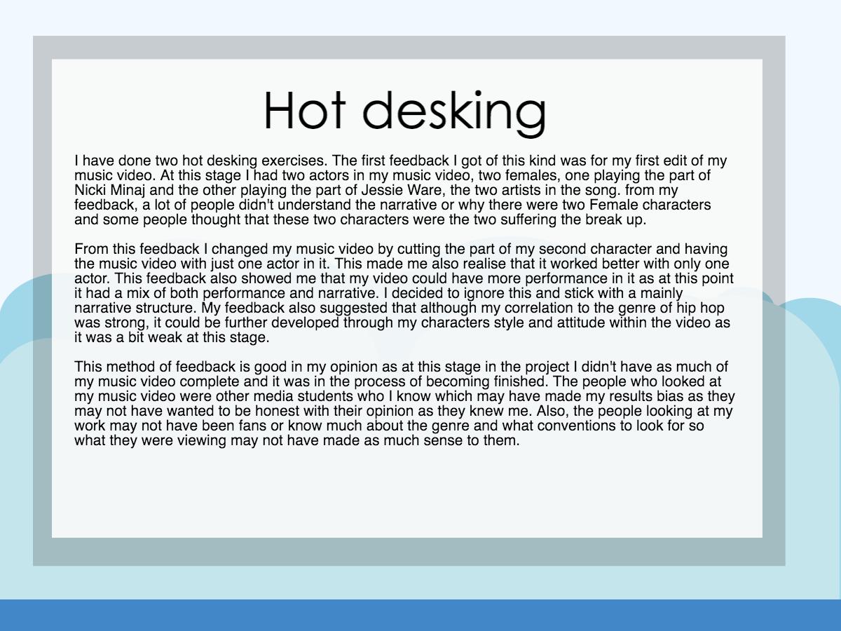
Music Video Second Draft
This is my second draft of my music video, I have made some changes, one of which is cutting my second actor out of the video due to the comments from my first audience feedback. Many of the comments were people being confused about who she was and why she was there, I plan to re film using a more concept approach and will mix this is with more shots from my main actor.
Saturday, 30 January 2016
Digipak and advert images


These are the two images I am using for my digipak and poster, the first images show the finished product and the other images show the original images with the gold overlay.

This screenshot shows how I did this. I added a contour filter to show me the contours of the image, then traced over these contours with the drawing tool and added a bevel and emboss.
Friday, 29 January 2016
Digipak/Advert Text Design


This is the first font and idea I had for my products. I feel like this font relates to the style in my music video and links to my artist's iconography. I have kept the text and background black and white as this will be the style of my digipak and advert design as I am now going for a minimalistic look after getting inspiration from other digipaks such as 'Watch The Throne' 'The Heist' 'The Blueprint' and 'The Pinkprint'.


This is another font I am considering using. I prefer this because it is more minimalist and subtle which is what I wanted from my typography. From my hot desking feedback, I found that the first font was favoured by others but I think this second font will work better on my products.

One idea I would like to pursue is this gold effect that can be found on this album (Watch The Throne). This is because The colour gold is often associated with hip hop music and many of the artist like to show off their wealth by wearing gold chains or gold jewellery. Stuart Hall's reception theory can be applied here, if my audience sees this gold effect on my products it may help them recognise the genre and think of similar digipak designs such as this one and I also think it is a rare design which will allow mine to stand out from other products.


I have learned how to give a gold looking effect to my text using photoshop, I think this is a good effect but will have to decide whether to give my text the effect of looking like gold or keep it as a block colour and explain that it would have to be printed with metallic ink. I also think this font is too thick to have the same look as a thinner font would look with this effect.


This is the same font and effect from above, I think this works better with the gold effect as it looks more shiny and it is easier to notice the bevel and emboss effects added.
Thursday, 28 January 2016
Font for my products

Wednesday, 27 January 2016


Friday, 22 January 2016

Nicki Minaj 'Pink Friday Roman Reloaded' magazine advert analysis
Please hover over image to reveal text

Thursday, 21 January 2016


Friday, 8 January 2016


Tuesday, 8 December 2015


Subscribe to:
Comments (Atom)