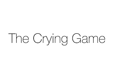
This is the first font and idea I had for my products. I feel like this font relates to the style in my music video and links to my artist's iconography. I have kept the text and background black and white as this will be the style of my digipak and advert design as I am now going for a minimalistic look after getting inspiration from other digipaks such as 'Watch The Throne' 'The Heist' 'The Blueprint' and 'The Pinkprint'.
This is another font I am considering using. I prefer this because it is more minimalist and subtle which is what I wanted from my typography. From my hot desking feedback, I found that the first font was favoured by others but I think this second font will work better on my products.
One idea I would like to pursue is this gold effect that can be found on this album (Watch The Throne). This is because The colour gold is often associated with hip hop music and many of the artist like to show off their wealth by wearing gold chains or gold jewellery. Stuart Hall's reception theory can be applied here, if my audience sees this gold effect on my products it may help them recognise the genre and think of similar digipak designs such as this one and I also think it is a rare design which will allow mine to stand out from other products.
I have learned how to give a gold looking effect to my text using photoshop, I think this is a good effect but will have to decide whether to give my text the effect of looking like gold or keep it as a block colour and explain that it would have to be printed with metallic ink. I also think this font is too thick to have the same look as a thinner font would look with this effect.
This is the same font and effect from above, I think this works better with the gold effect as it looks more shiny and it is easier to notice the bevel and emboss effects added.


No comments:
Post a Comment